San Diego FC Logo Revealed For New MLS Team

San Diego is the newest city to host an MLS team. Starting in the 2025 season, the San Diego FC will compete in the U.S. professional league.
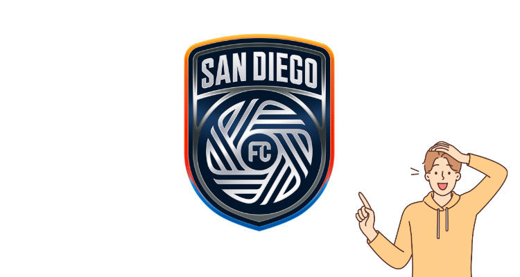
With the announcement, the club unveiled its brand identity, which includes its name, crest, and colors. The team will be known as San Diego Football Club, or San Diego FC for short, becoming the 11th MLS team to be an “FC.”

The logo was designed by design firm Pupila, which conducted extensive research through focus groups, member surveys, and meetings with the San Diego community.
The new logo features 18 lines linked together like a soccer ball, representing the 18 communities of San Diego County.
The center of the design contains an FC flow which represents the team’s ability to perform at a peak level while embracing San Diego’s unique rhythm of life.
Lastly, the “San Diego” at the top is a nod to the arches woven into the city’s architecture.
In my opinion, the design looks pretty old school. I personally like the simplicity of logo designs so I’m not a huge fan. I do respect how they integrated the community and the rich-culture of San Diego into the brand.
The club’s official colors are chrome and azul. The logo is said to center around four “principal virtues” that define San Diego: gratitude, proud, not loud, diversity, and a state of flow.
I’m excited to see MLS expand into San Diego where they have a diverse population, many of them enjoy the sport of soccer.

Written By: Beau Bridges
Beau is the founder of SoccerNovo, dedicated to helping players and parents navigate the youth soccer landscape. As a former youth coach and soccer parent, he shares insights on player development, recruiting, and the ever-evolving soccer scene in the U.S.
Let’s connect


