NYCFC Unveils Updated Logo

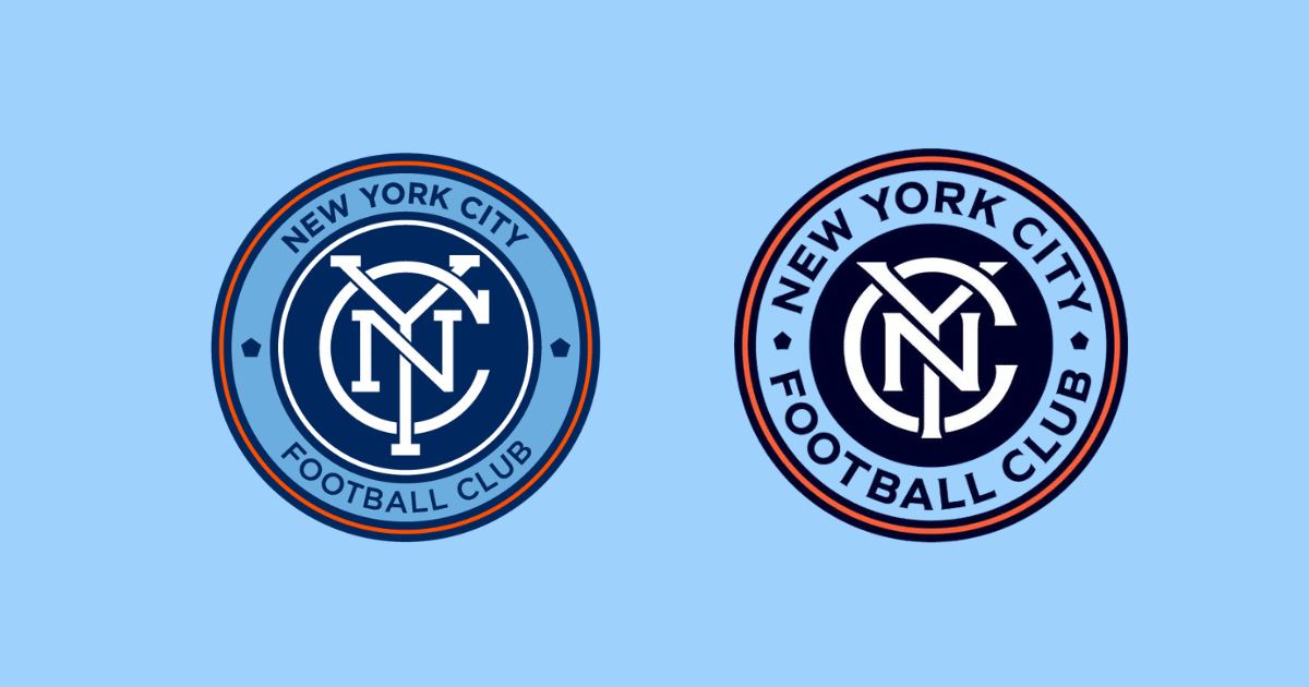
New York City Football Club (NYCFC) recently unveiled an updated version of its logo (new on the right).
To the naked, it doesn’t look like much has changed. And, you’re right. The circle logo encompasses the “New York City Football Club” text along with the NYC icon.
So, what changed? Here’s what the designer, Tobias Frere-Jones, refreshed.
- Updated colors (lighter blue with darker blue inside)
- Lighter orange ring
- Bolder lines
- Bolder font with less space
I love how they took the input of fans. Among MLS fans, this is a recognizable logo. I love how they kept the same concept but spun it to make it more modern.

Written By: SoccerNovo
SoccerNovo is an independent youth soccer media brand built to help parents, players, and coaches better understand the game and the pathways available in U.S. soccer. Our mission is to make youth soccer simpler, clearer, and more accessible for everyone involved in it.
Let’s connect


